/
avitazen
Brand Strategy
Logo Design
Color and Typography
Brand Guidelines
What we did
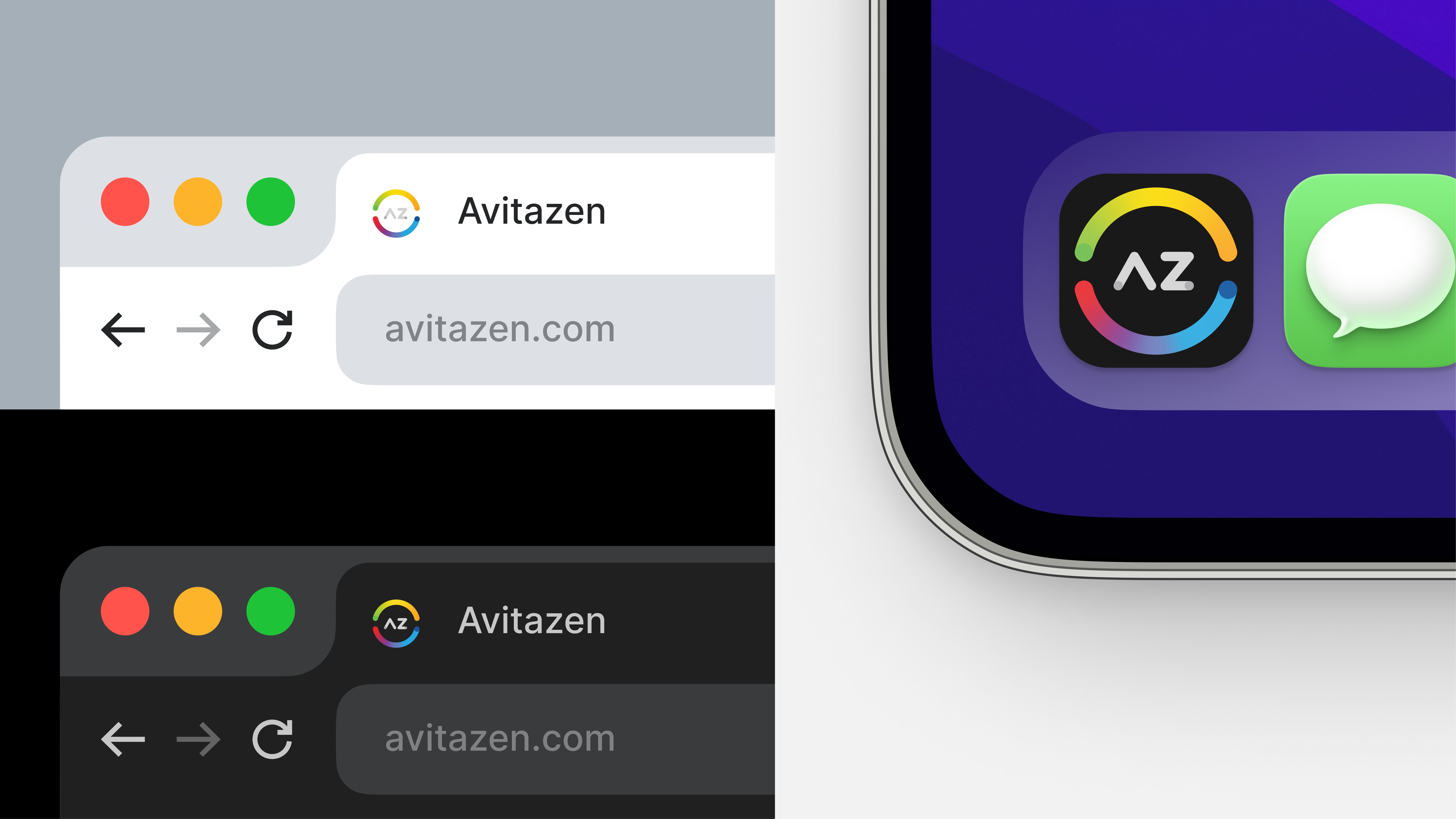
We spearheaded the rebranding process for Avitazen, delivering a visual identity that included a new logo, typography, color palette, and brand guidelines. The focus was to encapsulate Avitazen's core philosophy while creating an updated and versatile look that resonated with their target audience and reflected their commitment to wellness and balance.
How we did it
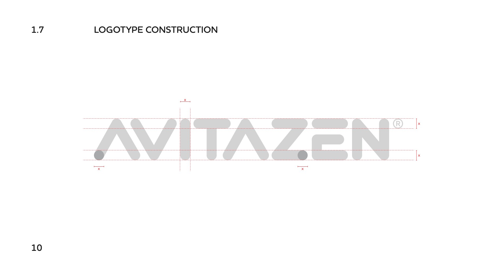
We began with a strategic discovery phase, involving some discussions with Avitazen’s leadership to understand their philosophy and vision. The name "Avitazen" was central to our creative direction, inspiring us to craft a visual identity that communicated both completeness and tranquility. The new logo was designed to symbolize Avitazen’s holistic approach, integrating elements that represented wellness and growth.
Brand guideline
The brand guidelines were developed to ensure that this new identity was consistently applied across all touchpoints, enhancing recognition and trust. We focused on keeping the brand approachable and relatable, reinforcing Avitazen's mission to support their customers from "A" to "Z."


